John Lautner – The Lautner Compound, Desert Hot Springs, CA (1947)

In 1947, when Oscar winning director Lucien Hubbard commissioned Marquette Michigan native, John Lautner to design a geometric compound in the Mojave Desert, they envisioned sunken living rooms enclosed by large expanses of sheet glass, concrete, redwood, and steel. These tiny vacation homes each with their own private cactus garden would overlook a golden, mountainous Sierra Nevada backdrop in Desert Hot Springs, CA – near the striking Mecca of west coast modern, Palm Springs. Originally called “Lautner Living Units for Bubbling Wells Subdivision,” the master plan for the compound was conceived as Hubbard’s desert getaway—a hip enclave of abundant buildings, shops, and pools for hosting his constantly evolving entourage of glamorous mid-century movie stars.

But how did Lautner, originally from the far reaches of Michigan’s Upper Peninsula, end up crossing paths with such Hollywood elite? And how, with its star-studded distinction, did the compound lose touch with its glamorous silver screen past, only to sit twenty years vacant? The story includes a little Frank Lloyd Wright, some Michigan roots, a heroic rescue, and Lautner’s approach to organic architecture where nature inspires design.

Twenty Years Vacant

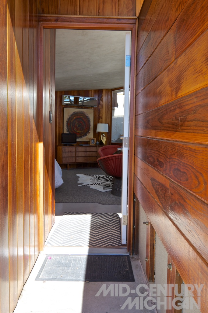
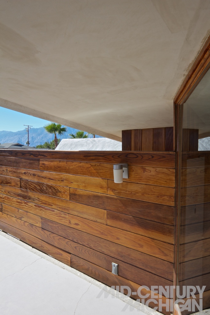
Situated in a quiet residential cluster along a sparse stretch of desert highway in Coachella Valley, The Lautner Compound (as it is now called) is perhaps one of the only Lautner sites where visitors can pay  a visit, as most of his works are privately occupied residences. To the approaching visitor, the location suddenly appears almost as if out of nowhere amongst the nondescript facades that dot its sleepy residential surroundings. The modest, yet stylish redwood and concrete privacy walls seen from the street view neatly conceal the surprise that awaits within this boutique hotel, and event space. Equally surprising is the story of this landmark’s neglected past.

As Hubbard’s career wound down, so did use of the property. By sometime around 1960, the compound was still an incomplete version of its original master plan, with buildings sitting mostly vacant. When Hubbard died in 1972, 600 acres of the property were sold off in lots, the pool house had been destroyed by a fire, and the future of the compound seemed uncertain. As the property changed hands, so did its use. In 1980, its then-owner decided to convert the four remaining prototype units into apartments. At some point, a subsequent owner then began operating the property as the “Desert Hot Springs Motel.” This is how Hubbard’s dream survived – if barely – as it continued to change hands. In 2008, the fifth, and current owners of the property, Tracy Beckmann and Ryan Trowbridge, came to the rescue.

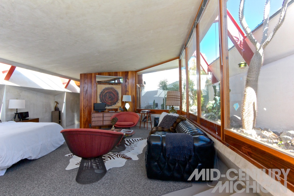
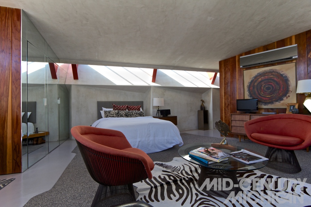
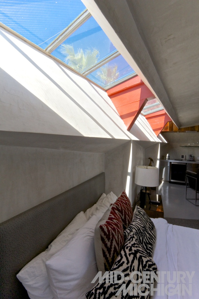
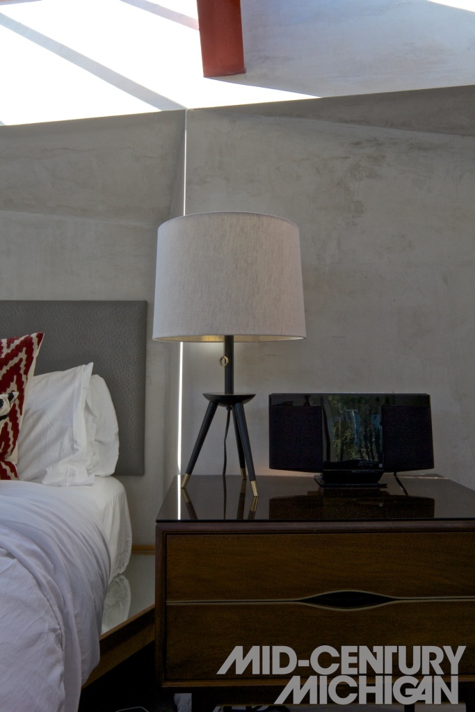
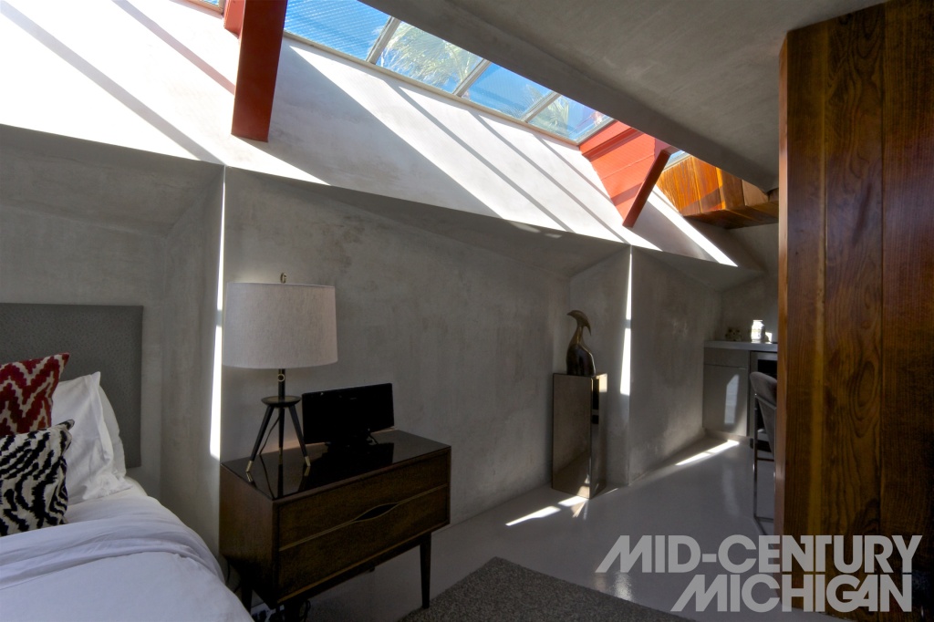
Beckmann, an interior designer, and Trowbridge, a Michigan Native and furniture designer, were inspired by the vision of this futuristic enclave of “living units” (as Lautner called them), and saw an opportunity to recreate, in part, the vision Hubbard and Lautner were never able to fully realize. After three-and-a-half years of renovation, the result is what they call a “micro resort.” Their diehard modernist influence shows not only in the period appropriate furnishings (which are unique to each unit), but also in finishes, material choices, and custom furniture designed and built by Trowbridge. Take, for example, the custom built steel and redwood bed frames with their attached, floating nightstands that carefully hug the complex sawtooth form of the interior concrete walls. Such site-specific design choices show a deep understanding of Lautner’s design. Carefully selected accoutrements such as a collection of vintage LP’s and a record player, books, and vintage photographs dot the rooms. Modernist furniture of design pedigree both chronicled and obscure create comfortable places to lounge while dramatic lighting chosen by Beckmann bring back the primary element The Lautner Compound had been devoid of for most of its life – a soul – and an understanding and appreciation of Latuner’s work.

The Experience

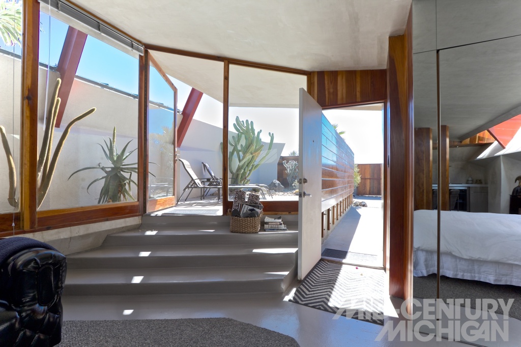
Each of the four 700 sq. ft. foot units are uniquely furnished, and bear names such as “The Bachelor Pad,” and “The Redwood Lounge.” The interiors have a feeling of being well settled into the land, due to Lautner’s decision to incorporate an elevation change between the main interior space and the raised cactus garden and connected patio, which wrap around and enclose the sunken space, separated by only large sheets of glass. The grounded effect is exaggerated by a sloped roofline that starts low on one side of each unit, reaching upward and outward through the glass wall, as if curling open toward the sky. Inside, guests are treated to many surprises. Take for example a clear glimpse of the starry night sky through swaying palm trees directly over the bed, viewed through a band of angled glass that forms a long, slender skylight running the entire length of each unit. The glass walls that separate the interiors from cactus gardens begin just above seating level, and bring nature close during relaxing moments in low-slung lounge furniture.The private patios, accessed by a shallow ascent of concrete stairs, are completely enclosed by redwood and concrete walls, and offer a completely private outdoor space for guests to relax under the boundless desert sun while offering sweeping vistas of the nearby San Jacinto mountains. Each unit also boasts a sleek kitchen and bathroom, where perfect function meets high end appointments. Public amenities such as communal outdoor barbecue area, fire pit, and saline dipping pool are fully enclosed to ensure a sense of privacy. The compound also boasts a 10,000 sq. ft. open air event space dubbed “The Park,” perfect for large parties and weddings, along with an adjacent 1957 California bungalow “The Ranch House.”

Hollywood Fame

The connection between Lautner and Hollywood neither starts, nor ends with The Lautner Compound. Lautner’s body of work includes residences so picturesque, and so well integrated into their sites that Hollywood hasn’t been able to keep their camera lenses off of them for decades. Take for example, the Elrod House, a Palm Springs home on a rocky site where natural boulders pierce through glass walls, a place that set the stage for an all out brawl between James Bond, and his attackers, Bambi and Thumper, in the 1971 Film, Diamonds are Forever. Others might recognize Lautner’s iconic concrete and glass party house, the Sheats-Goldstein Residence (1961–1963), known for its appearance in The Big Lebowski, several music videos, Charlie’s Angels: Full Throttle, and other films. Or take for instance the Shaffer house (1949) set as the backdrop in Tom Ford’s stylistically poignant film, A Single Man. Even Lautner’s commercial work, like Googie’s coffee shop in L.A. (1949), (featured in Quentin Tarantino’s Pulp Fiction,) has made impact beyond Hollywood, spawning its own architectural term. “Googie,” is now used in a greater sense to refer to flashy and futuristic roadside architecture seen in some mid century modern diners, bowling alleys, and motels. Despite Googie being a term once used disparagingly within the architectural community to discredit Lautner’s forward thinking, ever unique approach to architecture, it has now become a zeitgeist of retro-futuristic, atomic, space age, design.

Michigan-California Connection

Considering John Lautner’s upbringing along the secluded, rocky, woodland shores of Michigan’s Upper Peninsula, it seems improbable that he would later end up in California designing homes for the rich and famous, leaving a mark that would earn him a spot amongst the greatest modern architects of the 20th century. Furthering that improbability was Lautner’s first impression upon arriving in Los Angeles, where he described the atmosphere as “so damned ugly, I was physically sick for about a year.” John Lautner’s origin story involves a creative family, Frank Lloyd Wright, and a time and place where forward-thinking clients with deep pockets were creating their own unique, distinctly American vision of an innovative postwar future.

John Lautner was born in 1911 in Marquette, Michigan. Situated along the rugged coastline of Lake Superior, Marquette was known at that time as a mining town and shipping epicenter of northern Michigan, but not necessarily for its architectural heritage. Lautner’s first exposure to home design and construction came when he was twelve, when together, his family hand-built a log cabin on a rocky point along the shore of Lake Superior, which they called “Midgaard,” a Norse word describing a place at the center of the universe, between heaven and earth. Lautner’s creative spirit was fostered by his parents; his mother a painter and interior designer, his father also an artist, and foreign language teacher. After reading Frank Lloyd Wright’s autobiography, Lautner’s mother reached out to Wright and secured her son a spot in his Taliesin Fellowship program. Lautner would then spend the next six years between Taliesin locations in Spring Green, Wisconsin, and Taliesin West in Scottsdale, Arizona, where he rapidly progressed through the program, supervising the design and construction of many of Wright’s buildings. 

In 1938, Lautner relocated to Los Angeles, where he continued to support Frank Lloyd Wright and the Fellowship through at least 11 more projects around L.A. The move to L.A., however, was a jarring one for Lautner. After growing up amongst the natural wonders in the oftentimes secluded Upper Peninsula of Michigan, and spending time at Frank Lloyd Wright sites, where nature is glorified through its connection to architecture, Lautner took issue with L.A.’s sprawling, urban landscape. “I had been used to everything beautiful,” he said, “and here everything’s ugly. I couldn’t imagine doing anything as ugly as Los Angeles.” Perhaps it was with this in mind that Lautner began his prolific solo career, budding with the intent to create beauty in a land he perceived to be devoid of it. And L.A., land of the rich and famous, provided him and his associates with the clientele that had the financial means, creativity, and vision to support Lautner’s visionary work.

During his career, John Lautner designed over 200 buildings, mostly residential commissions in and around Los Angeles. He became known for his organic, site-specific approach to design, where natural features such as existing boulders, trees, vistas, and elevation changes in terrain influenced how each building was designed. Therefore, Lautner’s works are considered unique, in that design solutions, materials selection, and construction techniques vary considerably from project to project. As with his mentor, Frank Lloyd Wright, connecting the indoors to the outdoors was key to Lautner’s design ethos. However, Lautner took it a step further, often incorporating state of the art technology to do so. One early example, the Foster Carling house (1950), boasts an automated hinged wall with built-in couch, which can be electronically pivoted open onto the terrace (a design feature he would later revisit in the dining room at the Turner House in Aspen, CO, [1982]). Even the pool at the Foster Carling brings the outside in, by flowing beneath a plate glass wall into the living room. Similar design features are also found in his iconic Palm Springs house for famous interior designer, Arthur Elrod (1968), which also boasts electronically retractable glass walls, and an indoor/outdoor pool, and a staircase formed from pre-existing boulders which pierce through a frameless sheet glass wall, which was custom cut to follow the contour of the stones.

Visiting

The Lautner Compound gives a rare, first hand experience of the magic John Lautner was known for creating, where space is manipulated to both respond, and react to its environment. Being inside conjures primordial feelings of shelter and warmth, despite having constant, unobstructed views of desert cacti and the sky, with the rugged natural beauty of the Mojave desert and San Jacinto mountain range nearby. Stepping inside one of the geometric suites feels just as much like stepping into the future as it does into the past, creating senses of both wonder, and repose. Because most of his works are private residences not open to the public, The Lautner Compound is an unforgettable experience, and one of the few John Lautner creations open to visitors. To learn more about Lautner’s legacy and work, visit the John Lautner Foundation.

Posted in John Lautner | Tagged , , , , , , , , , , | Leave a comment

James Bronkema – Steel Home, 1952

James Bronkema - Steel House, 1952 00002

The family who lives in this 1952 James Bronkema home are no strangers to attention. Looking like an example of of the Case Study House program, their home would not seem out of place in a history book amongst other famous modern houses of the era. Its steel construction, large expanses of glass, and lush green roof have naturally sparked the curiosity of many passers-by. Strangers sometimes even approach the front door, only to be greeted first by the family’s two Chihuahuas (Ted and Ignacio, or “Nacho,”) before meeting the four person family that calls this classic home.

James Bronkema - Steel House, 1952 00003

Sundays seem to be peak traffic time for the “cul-de-stalkers” as the family calls them, “when everybody gets out of church. They come with cameras. They shoot video. Some people will knock on our bright green door.” “The door color was our idea,” the son smugly adds, referring to his younger teenage sister and himself.

James Bronkema - Steel House, 1952 00004

The family’s house is one of seven modern homes on their dead-end street, all built in the 1950’s by James Bronkema. At the time their home was built, a young James (Jim) Bronkema was making a career for himself constructing notable modern homes around Grand Rapids and selling real estate. Shortly before their home was built, Bronkema purchased the lot on which he would later develop this modernist enclave the family calls their neighborhood. Their home was the first to be built, and was commissioned by Frederic Fay, who made his living in the furniture industry. His son, Brad recounts how the home came to be. “My dad was very interested in modern architecture, and so when he heard about Jim Bronkema, he was really excited to do this house. He worked closely with Jim on the design of the house, as he himself was not unfamiliar with a drafting board. Construction began in 1952, and in 1953, we moved in. One of the touches my dad left was a drafting table built into the dining room area. Behind some folding doors, it would emerge, and there he would often do his work in the evenings.” Brad would continue to live in the home until he was around eight years old.

James Bronkema - Steel House, 1952 00005

Constructed primarily out of glass, steel and concrete, the home was assembled from many ready-made parts, and was a radical design for its time. (It wasn’t for instance until a decade later that renowned mid-century modern architect, Donald Wexler wowed the world with his now famous prefab steel homes built for Alexander Construction Company in Palm Springs, CA.) Inside of the home, slender steel support columns rise out of the concrete slab floor, carrying the weight of the corrugated-steel roof through a series of I-beams that run in one of two directions depending on which wing of the L-shaped house is being viewed. Because the steel framing supports the weight of the roof, there is little need for load-bearing walls, allowing for large expanses of floor-to-ceiling glass where the visual barrier between dwelling and nature dissolves. The blackened steel I-beams penetrate the largely transparent exterior walls, and carry the roofline from indoors to outdoors, adding a sheltering sensation to an otherwise very open floor plan. Originally, some of the interior walls did not reach the ceiling, as is seen in the kitchen, enhancing the sense of openness (though some walls have since been fully enclosed for privacy.)

James Bronkema - Steel House, 1952 00006

“My parents were very social,” Brad recounts from his childhood. We hosted a lot of bridge clubs, potlucks, and gatherings at that house. A lot of our guests were enthralled by our home to say the least. They thought it was truly unique for its time. In fact, it’s still unique today, as it’s the only Bronkema house of its kind. I do remember people coming through and being just in awe. My dad loved giving little mini-tours. It had some modern touches, like central A/C, which wasn’t very common in Grand Rapids at the time.”

James Bronkema - Steel House, 1952 00014

Eventually, the home would change hands many times before the current homeowners bought it. “My mom didn’t like the house,” Brad admits. “She was not into modern architecture at all, and we eventually moved to Forest Hills where my dad collaborated with builder John Vandenberg on more contemporary tri-level house. She was not at all thrilled with the house for a lot of reasons. There were no kids in the neighborhood for my brother and me to play with for instance, and on top of that, the house would not heat! At some point, a second furnace was added to the house off the dining room to keep the dining/living/kitchen area warm.”

James Bronkema - Steel House, 1952 00012

The challenge of climate control in a mostly glass, concrete, and steel home in Michigan was one of the many challenges the current owners had to consider when they purchased the home in 2006. The flat roofline turned out to be a perfect match for the living green roof they installed, which insulates the home in both hot and cold weather. The home’s floors had embedded ductwork made of cardboard laminated with tar that had rotted and become moldy. Their daughter recalls, “when we first looked at this house, I said ‘this place smells disgusting. I don’t want to live here!’” “So the kids learned a lot about general contracting early on,” the father jokes. “We ripped it to the studs. We had a bobcat in here at one point to rip out the old concrete slab and had new concrete floor with radiant heat poured.” The family moved into the home in December 2007 after their intensive renovation. In total, it took about 8 months for remodel. “And in the end, the kids still did well in school through the intensive ordeal, and we’re still married,” jokes the mother.

James Bronkema - Steel House, 1952 00013

“We first saw the house during a holiday party after returning to Grand Rapids after living in a large mid-century modern home in Texas, and thought it was really cool,” the family recalls. “We thought, man, this is the best house, but we’ll never live here because we’ve got two kids, and, it just seems like it’s not gonna happen. By that point, the house had changed a few owners and, was chock full of antiques and trinkets, there was wallpaper everywhere, the kitchen had a drop ceiling added, and some of internal steel I-beams supporting the roof had been clad in plywood. After traveling to Germany and seeing how some people live there, decided we had to downsize!” they add. “When we came back, the previous owner was preparing to sell it, so we bought it off-market directly from him.”

James Bronkema - Steel House, 1952 00009

Because of the house’s high level of transparency, curating the outdoor spaces became an area of focus for the family. “The yard is entirely Michigan native plants, meant to be low-maintenance. We pulled out any non-native plants early on,” they mention. When it precipitates, the roof drains into a main cistern used to water the backyard. Behind the house the wooded lot features a sunken patio, a serene reflecting pool, and outdoor kitchen, covered by the cantilevered roof. The front and side yards are overtaken in the spring and summertime with wild strawberries which serve as not only ground covering, but a tasty snack for both the family, and the dogs. Closer to the road, the family keeps a prolific vegetable garden, which provides a variety of fresh ingredients for their creative vegan meals. In a sheltered area behind the master bedroom, a sculptural red slate fountain gently bubbles, creating a serene soundtrack for when night falls. Flowing like a black river outward from a glass wall in the master bedroom, a collection of Mexican beach pebbles aligned in a sinuous form help direct drainage away from the home. No detail was spared curating the exterior. Even the power lines running to the home were buried as to not detract from the atmosphere.

James Bronkema - Steel House, 1952 00011

When it comes to the interior, the family reached out to their late friend, Nancy Phillips for advice. (Nancy met her husband, graphic design legend Steve Frykholm while working at Herman Miller in spatial planning.) “Nancy was instrumental with giving feedback on our house,” they state. “Many times, we asked ourselves, ‘what would Nancy do?’ We remember her saying ‘It is better to have a dirty light-colored floor than a clean dark one.” Noticeably, the concrete floors have a white finish. One of the family’s proud contributions to the interior is the design of the floating cabinetry in the main living area, which houses the entertainment center. “The form was inspired by Donald Judd, and helps us hide clutter.” Mid-century modern furniture mingles alongside contemporary pieces throughout the living spaces. The centerpiece of the living room is a K. Kawai grand piano, which the family’s daughter plays.

James Bronkema - Steel House, 1952 00021

The bedrooms feature custom built-ins for desks and shelving, and elevated bedding with cabinetry filled with storage below. The only major modification to the footprint of the house is a very small addition to the master bedroom, just large enough to fit a bed. Because the same corrugated steel ceiling is no longer readily available, the addition is the only place a flat ceiling is seen.

James Bronkema - Steel House, 1952 00016

In the kitchen, original white enameled steel St. Charles cabinets look as new and sleek as they day they did when they were installed. “The wet bar found around the corner in the dining area behind a pocket door was part of the original kitchen,” they mention. “It was so cool that we wanted to have it somewhere, but not have it be the centerpiece.” Stainless steel appliances and a wraparound stainless countertop add a high level of function to the L-shaped gourmet kitchen.

James Bronkema - Steel House, 1952 00019

Throughout the home artwork is featured. In the master bedroom hangs a hand-numbered signed lithograph by Alexander Calder, depicting Grand Rapids’ own La Grand Vitesse. The piece was a gift from grandparents of the family, and the primary blazing “Calder red” featured in the print inspired the color chosen for the curtains that cordon off the closet adjacent.

James Bronkema - Steel House, 1952 00018

Needless to say, this family’s home is an anomaly among the majority of modern homes found in Michigan with its steel construction and pavilion-like form. Looking more California contemporary than Michigan modern, it is no wonder that its sleek looks still attract observers over 60 years later. And if its magnetism still pulls in the passer-by decades on, how was its public reception when it was still a young community? Brad, who grew up in the house shares, “Living here as a child absolutely had an impact on me. I’ve always had a great appreciation for modern architecture, especially Jim’s houses, and that love started here.”

Posted in Uncategorized | 8 Comments

Chuck Carter – 1967

Chuck Carter - 1967 001

Illustration Courtesy of  Michael Nÿkamp of MKN Design.

Illustration Courtesy of Michael Nÿkamp of MKN Design.

Flash back to April 21, 1967, when forty-five tornados ripped through the midwest, leaving a path of destruction from Missouri to Michigan. Grand Rapids witnessed at least two of these powerful vortexes, one one of which left a newly built modern home by Wayne McClure in shambles. When the lot and remaining structure consequently went up for sale, the neighbors across the street saw a potential to build a new home for their evolving needs, and purchased the wreckage. Using the foundational footprint of the original home, they commissioned architect Chuck Carter to rebuild something new out the remains. Looking at it today, is hard to imagine that in a neighborhood where mid-century modern houses stand out against their traditional counterparts, that one of the handsomest examples amongst the bunch was once a dilapidated structure.

Wayne McClure at 2550

Photo courtesy of West Michigan Modern from the Betty Gibout Real Estate Collection, Grand Rapids Public Library.

Today, this Chuck Carter house catches the eye with an ultra-modern form that somehow feels right for its neighborhood. It is a series of interlocking volumes, right angles, and mix of materials such as stacked stone, large expanses of glass, and vertical siding that give this home a decidedly retro-futuristic feel. As attractive as it appears on the outside, it is every bit as stylish on the inside, lovingly curated by modernists, Tom and Vickie, who have called it home since 1986.

Chuck Carter - 1967 015

The home sits far back from the street, greeting visitors with beautiful landscaping trailing up a gentle slope that leads to the covered entryway. Here, a stacked stone wall leads to the front door, piercing the exterior and continuing inside of the house, where it divides the entry hall from the living room on the left. It does not, however, reach the ceiling, leaving an open, airy space between the two rooms. From this entry hall, it becomes apparent that the home is a cascade of three levels, allowing the occupants to look both down into the lower level, and into the open hallway upstairs at once. This junction occurs in the dining room of the house where the open space between the three levels is punctuated by the metal chimney of a freestanding matte black fireplace found downstairs. Two floating wooden staircases bridge the different heights, leading either up, or down, and are flanked by a thin metal railing — a 1960’s design element that Vickie asserts would never pass today’s safety codes. It is because of these three offset levels that the home takes on such a distinct shape from the exterior, with its dynamic volumes and varied rooflines.

Chuck Carter - 1967 030

Judging by the choice of furniture and objects placed throughout the house, it is clear that Tom and Vickie have a serious eye for modernism and art. “You can tell by looking around that modernism has been in our blood since before we were married,” Vickie says. “I was in home economics at MSU, and some of the classes allowed us to visit Herman Miller in Zeeland. You can recognize the pieces,” she states, as she begins to point out the furniture by design icons George Nelson, Ray and Charles Eames, Isamu Noguchi, and more. “The only reason there isn’t a Herman Miller couch in our living room anymore is because now that we’re older and our friends are getting older, we need something we can get out of more easily,” she laughs. “The George Nelson Sling sofa that was once there is now downstairs” adds Tom. All throughout the house, items from Vickie’s extensive folk art collection can be found. Over the past several decades, their travels have allowed her to collect pieces from around the globe. Most of the collection lines the two George Nelson Comprehensive Storage System shelving both upstairs and in the lower level. Amongst her finds are many pieces by lesser-known folk artists, as well as original pieces by more notable outsider artists such as Howard Finster, who first came to widespread notice with his album artwork for R.E.M. and The Talking Heads. In two of the bedrooms hang an original signed print by Christo and Jeanne-Claude, and a hand-numbered Matisse lithograph.

Chuck Carter - 1967 033

Prior to living here, Tom and Vickie owned a modern home in the Albert Builders development less than a mile away. As Tom recalls “We really enjoyed that house. Something I liked about it was that all the windows were in the corners. We lived there about fifteen years.” At that time, Vickie was in real estate. She explains, “We were friends with the prior owners of this home. They had lived directly across the street from here before the tornado, but were outgrowing their home, as they had three boys and the kids’ grandmother to look after. But several years later when it was time for them to sell, they asked me to list this house for them. We liked contemporary design and had been here to parties a lot, so at that point, I went home to Tom and asked, ‘What would you think about buying the house for ourselves?’ Our own boys were grown, so the timing seemed right.” “We just loved this house all along,” says Tom with a chuckle, beaming as he looks at his surroundings.

Chuck Carter - 1967 021

Because the house was designed for a couple with three boys and a grandmother, a sense of pragmatism and function are noticeable in its layout. For example, the basement level is complete with its own living room, kitchenette, bathroom and sunken patio area with a private entrance, which would have served as an apartment for the grandmother. Today, it finds use as a complete guest suite. A card table in the basement folds into the built-in lighted shelving. Four skylights keep the home illuminated in a natural glow, and even allow for moonlight at night. One of the skylights forms a light well that extends from the top level the downstairs bathroom, penetrating into the basement through a pane of frosted glass. All bedroom closets have cabinetry and drawers built in. “Chuck Carter did a lot of great things. I’ll tell you…architects have great ideas,” Vickie remarks.

Chuck Carter - 1967 037

One of those great ideas was to increase the footprint of the house by adding foundation to the rear. This allowed for a new volume to be created, which serves as a storage area below, with a master bedroom above it. In the storage room lies a relic from the original home that was destroyed: a set of metal Geneva kitchen cabinets were salvaged from the wreckage and found their second life downstairs. Upstairs in the master bedroom, occupants can look out a wall of enormous glass sliders, and exit onto a railing-free balcony that overlooks a courtyard a short distance below. The other three bedrooms upstairs each have their own brightly colored doors, which share the same palette as the Herman Miller Company Picnic posters designed by Steve Frykholm, that hang nearby. These extra rooms have found adaptive reuse as a home office, and guest bedrooms.

Chuck Carter - 1967 026

Many things about Tom and Vickie’s house seem frozen in 1967, yet impeccably preserved, and completely livable by today’s standards. “We’ve built in some bookcases, but other than that, it’s pretty much original,” says Tom. The only major change that Tom and Vickie have introduced was an update to the kitchen. As it previously stood, retro features like wall ovens and a built-in countertop blender were once part of its “modern” amenities. Their remodel was sympathetic, however, where they matched cabinetry to what already existed, and chose simple forms and elegant materials.

Chuck Carter - 1967 004

“All of our neighbors around here have a strong sense of community and many of them are interested in modern architecture,” Tom concludes. Despite the lack of historic preservation ordinances in their neighborhood, it is because of owners like Tom and Vickie that gems like their own home color the neighborhood with their exquisite, unadulterated forms. But their house is extra special amongst the rest, carrying with it a story of creation and transformation, where out of rubble, a beautiful work of balance and form arose.

A special thanks to <a href=”https://www.behance.net/gallery/19232419/Midcentury-Modern-Homes-Collection”>Michael Nÿkamp of MKN Design</a> for the Illustration, and to Pamela Vander Ploeg of <a href=”http://westmichiganmodern.com”>West Michigan Modern</a> for the black and white photo of the Wayne McClure home that once stood in place.

Posted in Uncategorized | 2 Comments

Albert Builders – The Kendalwood

Albert Builders - The Kendalwood 002Built into the slope of a hill and completely glassed in on the entry level, Mindi and Kevin’s house is a standout on their block. A mixture of stacked slate, vertical wood siding, and a sloping post-and-beam roofline define the look of an era. From the street view, this house seems like a perfectly preserved time capsule of the atomic era. Step through the large red front door, however, and fast forward to present day, where Kevin and Mindi are raising their three kids in an ever-evolving atmosphere of energy and color.

Albert Builders - The Kendalwood 006

Kevin and Mindi’s home was built around 1964, and is part of a collection of homes in their neighborhood that were constructed by Albert Builders. Their home, the “Kendalwood,” as named on its architectural drawings, is one of hundreds of Albert Builders’ homes in Grand Rapids, many of which are sprinkled throughout Kevin and Mindi’s neighborhood, and easily identified by their modern lines and appealing use of glass, wood, stone, and brick. Silas (Sy) Albert, who founded Albert Builders, began developing neighborhoods during a housing shortage when many GI’s were returning home from World War II. Though the “Kendalwood” isn’t specifically attributed to them, Albert Builders frequently employed the skills of local architects, O’Bryen and Knapp, whose names adorn many of the architectural drawings of the homes they built, essentially bringing quality, architect-designed modern homes to the masses during the mid-century development boom.

Courtesy of Grand Rapids History & Special Collections, Archives, Grand Rapids Public Library, Grand Rapids, Mi.

Courtesy of Grand Rapids History & Special Collections, Archives, Grand Rapids Public Library, Grand Rapids, Mi.

Mindi admits she cannot leave anything around her untouched, and the Kendalwood is her creative playground. Since Kevin and Mindi moved in in 2009, their house has been in a constant state of change. “The whole house is a DIY project, and it needed a lot of work” says Mindi, who herself, is an interior decorator. Though she doesn’t recall exactly what triggered her enthusiasm for mid-century modern architecture (her background in English certainly didn’t do it,) perhaps it was the years spent working at an art gallery, where she cultivated a refined sensitivity to art and design. “When we started looking for houses, my husband, Kevin got sucked into the appeal of mid-century modern, so our search just branched out from there.

Albert Builders - The Kendalwood 014

Though not immediately apparent from the street view, their house has five levels. In the main entryway, a bi-level staircase leads to both upstairs, where the bedrooms are located, and downstairs, where a family room, dining room, and kitchen are found. Also on the entry level is a formal living room on the right. From the lower level, stairs lead down yet another half-level before descending to the basement. Being built into the hill, there is walkout access on the lower level in the dining room.

Albert Builders - The Kendalwood 017

“When we moved in, the lower level was very dark and closed off,” recalls Mindi. “We wanted to open it up more and use the natural daylight, because we knew we’d be spending most of our time down here.” Daylight now streams through a large skylight over the kitchen island, and bank of sliding glass doors in the dining room. A pass-through between the dining and living area lets daylight permeate even further into the house. Where walls were taken down during the remodel, support beams were left in place, but covered in a handsome walnut veneer. The end result is a completely open floor plan on the lower level, with spaces neatly defined by use of materials and furnishings.

Albert Builders - The Kendalwood 020

Wherever possible, salvaged items were used throughout the house during its transformation. Made of the remains of a bowling alley lane, the dining room table, for example, was a reassembled craigslist find, and is flanked by a playful collection of colorful mix-and-match chairs. The industrial metal sliding door for the pantry was also found via Craigslist. In the kitchen, metal washers and quarters embedded under epoxy create a shimmering bar countertop, which Mindi designed herself. Classic Herman Miller furniture, where present, is mostly second-hand.

Albert Builders - The Kendalwood 022

“At first, I decided I wanted to paint everything grey, and ended up coming home from the store with about nine different colors,” says Mindi. Kevin has been really supportive. When I say, ‘I think I’m going to paint a wall hot pink,’ he’ll hesitate, and then follow up with an ‘okay!’ Things are always changing around here. I’ve changed out the pendant lighting in the kitchen twice, for example, and am still not satisfied. I often have to ask myself, ‘Do I really want to do it again?’”

Albert Builders - The Kendalwood 013

Mindi’s relentless quest to improve and cultivate her family’s space shows in the home’s personality and charm. The amount of love the home has been given by the couple is apparent. Its vibrant pop-art color accents serve as an offbeat accompaniment to the home’s mid-1960’s origins. “I would love to have nothing but designer furniture in here, but with three kids under ten, that’s not happening right now,” Mindi quips. But given time and effort, Mindi and Kevin’s home becomes more and more of a familial self-portrait of modern day life mid-century modern home.

Albert Builders - The Kendalwood 028

Interested in Mindi’s Interior decorating services? Click here to learn more.

An extra special thank-you goes to the Grand Rapids Public Library for the original drawing of the Kendalwood. The Albert Builders Collection at the library primarily consists of architectural drawings of single-family homes designed between the mid-1950s and 1960s, and can be viewed online. The images in the collection are mostly front-elevation drawings; additional details and drawings can be accessed on-site from the archives.

Posted in Uncategorized | 1 Comment

Architect Unknown – 1958

Ask Paul and Leisa why they chose a modern home, and the answer doesn’t fit the usual gamut of responses you may expect to hear from a stereotypical modern home owner. For them, it was neither about fulfilling a philosophical dream of modernism, nor about curating a museum of modern design. Their approach is simply about comfort, functionality, family — not about living in a certain style or a particular era. The feeling of well-being that comes from living in a home so connected to its natural surroundings is what truly drew them in. “Though we’ve always liked modern homes, I had never heard the term ‘mid-century modern’ before living here,” admits Leisa. “I just love waking up every morning and looking at the garden and feeling like I’m outside.”

Architect Unknown - 1958 20

Hidden from the busy street, Paul and Leisa’s house sits behind a smaller traditional home they share a driveway with. Their house, placed in the middle of their block, is tucked almost completely away from street view and surrounded densely by trees. The lush yard and surrounding gardens serve as a canvas for Leisa’s green thumb. Walking out into the expanses of the backyard, Leisa remarks, “I bet you never thought this was back here, did you? You feel like you’re out in the country when you’re in the city,” as she looks upward toward the tops of the soaring trees. 

Architect Unknown - 1958 01

The home itself is an expansive, low-slung brick ranch with an “L” shaped footprint, and flat roof.  Its proportions and deep covered entryways seem immediately familiar to those keen to modernism. An attached carport is indicative of its mid-century modern roots. “The original clients ran out of money and couldn’t afford a garage door,” jokes Paul with a bit of irony in regards to the home’s otherwise luxurious fit and finish.

Architect Unknown - 1958 06

Materials such as slate, marble, brick, cherry, and rosewood compose the interior surfaces. The formal living and dining area make the most of the materials, with exposed brick walls and a cascading floor plan which descends from dining area to living area. A long, suspended rosewood-clad credenza spans this change of levels, supported by a series of balusters which are anchored to the floor and ceiling.  A wall of glass looks out onto a bi-level patio, enclosed by a short wall of brick. At the far end of the room, a wide, low fireplace sprawls across an entire wall.

Architect Unknown - 1958 10

“Somebody told me a student of Frank Lloyd Wright’s built this house,” Paul says. “But we’ve never been able to verify that. What we do know is that it was built in 1958. You’ll probably notice we don’t have any curtains back here,” pointing to the windows facing the yard. Even though we’re outdoors, there’s a serene sense of privacy.”

Architect Unknown - 1958 08

And that juxtaposition of privacy and openness is exactly the reason Paul and Leisa were originally drawn to the house. “After living here I’ve realized I couldn’t live in any place where I can’t feel like I’m outside when I’m indoors, because I love to be outside,” Leisa adds. And with so many views to the outdoors, and an enclosed backyard, the setting is ideal for the family’s lifestyle, which involves four dogs and plenty of outdoor time in the Michigan summer. Only steps from the kitchen and family room, their backyard patio with built in grill and pergola serves as an ideal setting for meals and relaxing with friends and family.

Architect Unknown - 1958 16

The bedroom wing of the home has four rooms, symmetrical in layout, and set up on two levels which bisect the main floor. Stairs that lead up and down to the levels create an intersection of multiple floors offset from one another. This area serves as living quarters for the couple’s two mature sons, as well as an office and music studio, which the boys make the most use of.

Architect Unknown - 1958 12

From the outside, the structure and proportions of Paul and Leisa’s home feel distinctively modern. Yet, on the inside, it radiates the coziness of a family home. The low, open entrances add an immediate sense of comfort and enclosure as one enters. However, the home’s large expanses of glass and beautiful wooded surroundings keep the feeling of nature always within arm’s length. These juxtapositions of enclosure and openness, simplicity and opulence, modern and traditional, all strike the perfect balance for housing today’s family. Just ask Leisa, and she won’t let you forget, “I just love my house!”

Posted in Uncategorized | 2 Comments

Charles Goodman – Alcoa Care Free Home (1957)

In 1957, Grand Rapids, Michigan was introduced to the work of prominent modern architect, Charles Goodman with the Alcoa Care Free home. Intended as a showcase piece for the Aluminum Company of America, the Alcoa Care Free home was a collaborative project exploring new uses of aluminum in home building, through what Alcoa dubbed in their sales brochure as the “greatest change in residential building materials in centuries.” Though the exact number is disputed, around 27 Alcoa Care Free Homes were built around the country and opened to the public for a six-week showing period. The intent was to promote Alcoa’s then new “Residential Building Products Sales Division.” Out of the examples remaining today, Jon and Lissa state their Care Free Home in Grand Rapids may be one of the best preserved.

Charles Goodman - Alcoa Care Free Home 01

Jon and Lissa, both advertising executives, have lived in their Alcoa Care Free Home since December 2011 along with their two small children, Quinn and Enzo. For the young couple, it was love at first sight. “I remember calling the agent to see it, though I wasn’t really sure if we’d want to buy it. But when we saw the house, we fell in love with it,” Lissa says. “We knew we absolutely had to have the house,” adds Jon.

Charles Goodman - Alcoa Care Free Home 31

With 7,500 pounds of aluminum used in walls, roof, window framing, and hardware (even nails), Jon and Lissa’s home was designed to require minimum maintenance for home owners, which helps contribute to its fantastic condition; aluminum does not rust or corrode over time. Along with decorative and structural aluminum, wood, glass, steel, and brick compose the home as main building materials. Local builder, Keith Pratt was chosen by Alcoa to construct this particular example, which was targeted to be priced under $25,000. Due to improper expectations set by Alcoa, the finished product costed closer to $60,000, which later led to a class action lawsuit between several builders of these homes and Alcoa. Though Alcoa had intended to sponsor the construction of 50 of these homes, and to later segue into a larger-scale project with multiple architects, the project was, unsurprisingly, cut short. The original sales brochure for the home lists 24 models built throughout the country, with Michigan home to three of them (the other two found in Birmingham, and Flint.)

Charles Goodman - Alcoa Care Free Home 07

With a symmetrical layout, the Alcoa Care Free Home is a classic mid-century modern ranch, with large expanses of floor-to-ceiling glass capping off either end of its peaked structure. A soaring, vaulted roof clad in cypress creates a sense of vastness for the 1,900 square foot main floor, where walls of tongue-in-groove teak add a sense of warmth and enclosure to the space. Interior clerestory windows between the bedrooms and entryways achieve what Goodman described as an “atmosphere of Space.” (Exciting new ways to build with aluminum. Better Homes and Gardens, October 1957.) Throughout the home Goodman chose a playful jewel tone palette of purple, teal, green and gold. These colorful finishes are found in cabinetry, doors, paneling, and fixtures. Exposed aluminum components are both colorfully anodized and bare metallic, adding a dazzling glint to the interior.

Charles Goodman - Alcoa Care Free Home 04

As a testament to their home’s authentic, unaltered condition, Jon admits, “We haven’t done a thing yet, honestly, except for painting two of the bedrooms. We have copies of the original brochures, which we’ve inherited with the house.” Using the brochure as a rough blueprint for their interior design ethos, Jon and Lissa have made use of the space as Goodman intended. For example, the couple’s bed is freestanding within their room because “this is how they had it in the brochure,” says Jon. The “family room” adjacent to the kitchen has not only a cozy place to lounge by the fire, but also leaves a large plot of open floor for the kids to play, just like in the brochure. “There is no furniture here, because it is usually just littered with toys,” adds Lissa.

Charles Goodman - Alcoa Care Free Home 10

Despite the Alcoa Care Free home being a mass-produced icon, every example had its own features, as each of the builders took a bit of liberty with the design. Their particular home, for example, has three fireplaces, (one in the living room, one on the patio, and one in the basement,) whereas some models have none. Their home also has air conditioning, which the house came equipped with. Whereas most Alcoa Care Free homes have a kitchen that backs up against a wall in the house Jon and Lissa’s is a freestanding room centered in the home, with stairs to the basement in the adjacent wall.

Charles Goodman - Alcoa Care Free Home 19

The kitchen, perhaps one of the most memorable rooms in the house, is a turquoise green galley that divides the living area of the home down the middle. A well-preserved example of the GE Wonder Kitchen, its modular metal structure features matching oven, drawers, cabinets, and “cabinettes,” compact storage units with tilted glass sliders, mounted just above counter height. A pass-through on the family room side allows for supervision of the children’s play area. Overhead, a row of lighting keeps the kitchen bright, while the vaulted wooden ceiling soars above.

Charles Goodman - Alcoa Care Free Home 15

“We love to cook,” Jon says “so we thought it would be a pain coming from a house with a big open kitchen to this narrow galley kitchen, but it’s really not. While some key appliances, like countertop stove and refrigerator have been replaced, the kitchen looks mostly as it did when the house was first built. “Even if the oven stopped working, it would stay there,” Jon comments. “It’s just too cool to mess with. I’m sure we’d find a way to repurpose it if that were ever to happen…We’d use it for storage or something.”

Charles Goodman - Alcoa Care Free Home 11

Because of the scarce nature of their home and its specific parts and finishes, Jon and Lissa have concerns about the challenge of preserving such a special house. To them, it is much like owning a vintage automobile, of which only a handful were built. For example, many of the aluminum features in the house are irreplaceable due to their custom stamping and production. “We have a couple of closet doors that have been dented through the years, and I don’t know what to do about them. I want them fixed,” Jon says “but I don’t know what to do to have them repaired.” Originally, the vertical windows that grace the side of the house once had blue anodized aluminum trellises, which have been removed. For now, they remain safely stored in the shop at the back end of the carport. “I might want to put them back up, but my wife may have other ideas,” Jon says with a chuckle.

Charles Goodman - Alcoa Care Free Home 03

Though preservation is at the forefront for the couple when it comes to maintenance and upkeep of their home, projects and visions for improvement are still ideas they entertain. The three bedrooms at the end of the house, for example, all face out to a courtyard and carport through floor-to-ceiling glass walls. “We don’t like looking out on to the carport,” Jon admits. “We intend to get a bricklayer out here to build a screen wall out of the same brick to create a continuous walkway. It might look nice with climbing plants.”

Charles Goodman - Alcoa Care Free Home 23

Because of Jon and Lissa’s attention to detail, and pride in ownership, the Alcoa Care Free home will remain under good care for as long as they own it, and their love for their house shows. “It’s not huge, but it’s enough space,” Jon insists. “What I really like about it… is that it’s a well planned out space. And taking good care of it is just part of owning something of this nature. You just don’t screw with a house like this!”

Charles Goodman - Alcoa Care Free Home 21

About the Architect

Charles M. Goodman (1906–1992) studied at the Illinois Institute of Technology until 1928, and trained as an architect at the Armour Institute of Technology until 1931. He is perhaps best known for designing and developing the Hollin Hills neighborhood of Alexandria, VA, an enclave of over 300 modern homes sited amidst a wooded backdrop. Another notable work is the Washington National Airport in Washington, D.C. Though Goodman worked as a government architect at the beginning of his career, most of his modern residential works were developed after he founded Charles Goodman Associates in 1946 in Washington, D.C. By 1956, over 32,000 of his houses were built around the country.

Posted in Alcoa Care Free Home, Charles Goodman | Tagged , , , , , | 11 Comments

Gunnar Birkerts – Freeman House (1965-1966)

Located on a heavily wooded lot lies an unusual prismatic structure. Nestled into the earth amongst a shroud of trees is a modern masterpiece and private residence, the Freeman House. Illuminated by natural daylight flooding in through angled panes of glass and clerestory windows, this home was designed to connect with nature and to provide a serene, almost spiritual sense of enclosure while granting maximum privacy. Barely visible from the street, its low profile and flat roof topped with a lopped-off pyramid is an indication of something peculiar.

Gunnar Birkerts Exterior 03

The entrance of the home is accessed from a busy drive. However, the only glimpse of the house from the street appears for just a second as one passes the white brick retaining walls that are built into a short, but steep hill, which funnel toward the entrance of the house. Even from this vantage point, the only hint of an interior glimpse is shown through a curtain glass wall that sits inside an overhang in the entryway. Here, a pathway descends with a few shallow steps across a slate floor into a narrowing enclosure that leads to the front door. Immediately behind this iron-gated glass screen lies another white wall and marble floor. This paradox of transparency and obstruction is strangely inviting, by evoking curiosity of what must be present where the eye cannot see. Accordingly, it is from within that this house is most striking.

To comprehend exactly what makes this house so unusual, it is important to know that the entire design originates from one single point. 

And that point is indicated by a peculiar black tile at the center of the house. Placed in the white marble floor of a sunken atrium, the tile is square in shape, with a white center. Like a small frame, this point is the nucleus of the floorplan, placed directly under the the center of the pyramidal roof. Like spokes of a wagon wheel, the radial grid on which this house was designed explodes outward, providing views through windows at every far end of the house and into the wooded setting beyond. This tile is a frame both literally and figuratively, allowing occupants to frame views into the furthest reaches of the home from this single point. All other rooms in this house expand outward in coordinance with this central space. One particularly unusual characteristic of this concept is that the grid is slightly off-center, making for a somewhat lopsided pyramid. This is most noticeable standing at the center point and looking straight up at the thirty-foot ceiling, from which a smaller, inverted pyramid hangs–the lopped off tip of the roof inverted. This cockeyed, upside down stalactite is encircled by a band of windows. Although unexpected, this slight lean in the roof line is functional by allowing the home to capture a great deal of daylight as the sun rises from the east. Sunlight is dispersed into rooms adjacent to the atrium through a continuous band of clerestory windows running the perimeter of a flat raised section of the roof, and through a series of internal windows along the top of some interior walls. This light-filtering effect is aided by the reflection of the pure white walls and the exposed beams of the ceiling, which form fins that channel the brightness of the sun.

Gunnar Birkerts - Freeman House - Living Room 03

Here in the atrium, a koi pond is placed in the floor against the northern wall. Views to the exterior come through several windows, some along the roofline, some looking out through the covered patio to the backyard, and others looking into a trapezoidal outdoor courtyard placed within the home. Round steps lead upward to both the master suite, and to an open area above the atrium, which houses a formal dining area, circular fireplace, and lounge. There are two sliding wall panels nearly two feet above the floor of the atrium (a steep drop) which lead either to a hallway that accesses two secondary bedrooms, or directly into the bedroom nearest the master suite. When pushed aside, these slim partitions create an even greater sense of openness, providing direct views to the outdoors via the bedrooms from the center of the atrium. (A third of these openings once accessing the master bedroom, has since been removed and plastered over.)

Gunnar Birkerts - Freeman House - Bedroom 01

Birkerts was very strict with the radial grid of the floorplan. Even the door edges and jambs are angled in accordance to this grid, making for almost no right-angled door edges. When opened fully, most doors in the house nestle into precisely fitted pockets and lie flush against the walls. Because everything was custom built for this house, Birkerts was careful in choosing a competent contractor, and commissioned local builder Jordan Shepard to oversee its construction. (Shepard, a regional legend, built several modern homes around the area.) Moving walls and doors are built with an impeccable level of precision, with fit and finish as tight and refined as a well-built cabinet. Many of the doors feature Soss invisible hinges which were manufactured in Detroit, and cabinets make use of piano hinges. Because of the quality of craft that went into building this house, as well as the care taken to maintain it, there is nary a sign of aging. The structure appears timeless, as if it had crystalized out of the earth on which it was formed.

Gunnar Birkerts - Freeman House - Bedroom Ceiling

As with most mid-century modern homes, built-ins are present in nearly every room. Birkerts used clever strategies to make use of spaces like the deep triangular window sills. All of these sills have built-in drawers and sit at desk-height above the floor with  open space below so that a chair can be pulled up. A good example of Birkerts’ desktop / window sill hybrid is the workspace corridor adjacent to the gourmet kitchen. Extending from behind a built-in breakfast nook, the outer kitchen wall forms a sawtooth shape which alternates between brick and glass, shielding views from the street. All along this zigzagged wall is another deep desk-height sill with drawers, shelves, and places to pull up chairs to. Because the windows in the home do not open, circulation is provided by screened vents built into the window sills that can be cranked opened to let air flow in from below.

Gunnar Birkerts - Freeman House - Bedroom Bookshelves

Birkerts’ expertise of hybridizing function and structure continues in the master bedroom suite. Connected to the bedroom for example is an amalgamated walk-in closet, dressing room, and bathroom space. Opposite of a twin vanity are mirrored walls that open to reveal cabinetry, drawers, and closet space. The bathroom and shower are found at the far end of this room, with the shower being partitioned by a glass wall. Here, illuminated steps descend into the  sunken marble-lined shower, which features a massive window overlooking the courtyard. Privacy from the adjacent living room window is provided by a series of three structural fins which extend at angles congruent with the radial grid. This courtyard can only be accessed from master bedroom by sliding glass doors and pocketed screens.

Gunnar Birkerts - Freeman House - Master Bathroom Shower 02

A similar set of sliding glass doors and screens are found in the atrium, facing the backyard. Here, a slate floor and covered alcove lead out into the yard. Nearby, a massive piece of rough-hewn bedrock seems to float on the surface of a small reflecting pool, water bubbling gently out of its crevices and over its surface. The serene space of the massive backyard unfurls beyond. Originally much larger than it is in its current state, the lot once encompassed far more neighboring properties. At the time the home was first sold, so were portions of the plot offered to the neighbors on the other corner of the block. This yard, still large compared to most properties in the neighborhood, is also home to several unusual plants and trees. Nestled closely to the house, for example, is a group of three soaring Dawn Redwood trees. Elsewhere in the yard, Sedge and Amur Maples provide shade. As a whole, the backyard teems with growth, engulfing the house in its lush canopy. A walk around to the front brings with it a variety of  flowers such as Trillium, Japanese Peonies, Daffodils, and Azaleas.Gunnar Birkerts - Freeman House - Exterior Backyard

In the case of the Freeman house, the beauty in Birkerts’ design is the match of setting and structure–of repose and élan. Over time, the lead coated copper roof has developed a white patina, a metamorphosis that echoes the growth and change of the setting which surrounds it. Because Birkerts’ designs aren’t necessarily linked to his previous work, there is always a specific approach in his solutions. In this case, the unorthodox radial grid structured by an orthogonal matrix yields a unique and highly unusual solution to maximize privacy while opening the house to nature in unexpected ways. The resulting effect is just as organic as geometric, a beautiful paradox, crystalline and lush. This sort of inviting enigma may be the only constant in Birkerts’ work, and the Freeman house is no exception.

Gunnar Birkerts Exterior 06

About the architect

Born in 1925 in Riga, Lativa, Gunnar Birkerts was birthed into an era at the cusp of modernism. While the likes of Walter Gropius and Mies van der Rohe were redefining contemporary architecture with their austere and minimalist approach to building solutions, Gunnar Birkerts was being raised by a family of scholars, writers, folklorists, and philosophers.

Gunnar Birkerts - Freeman House - Foyer 02

Near the end of World War Two, Birkerts relocated to Bavaria. After the war had ended, he applied for University under a displaced persons status. With his hopes set on moving to the USA, he began studying English when he was accepted to the Technische Hochschule in Stuttgart. It was in this academic setting that he was introduced to modernism, with drawing exercises occasionally conducted at the Wissenhofsiedlung (a housing estate built for an exhibition in 1927 featuring works from Le Corbusier, Mart Stam, Mies van der Rohe, and other contemporaries.) In 1949, Birkerts graduated with a degree in architecture and engineering.

Gunnar Birkerts - Freeman House - Kitchen 0

Without haste, Birkerts moved immediately to the USA upon graduation, arriving in New York Harbor within the same month. Then 24, Birkerts had followed the footsteps of many European architects who emigrated to the USA after the war, seeking a new life and new opportunities. Inspired by Eliel and Eero Saarinen, Birkets set his sights on Michigan to explore opportunities with their design practice.

Gunnar Birkerts - Freeman House - Foyer View to Living Room

Thus, Birkerts arrived  in Bloomfield Hills, Michigan at the doorstep of Eero Saarinen, who had to turn him down on grounds of not having work. Birkerts was then sent to Chicago on recommendation of Saarinen and was hired by Perkins and Will. Birkerts would later be beckoned by Saarinen to return to Bloomfield Hills, where he worked under the Saarinen’s for five years. His time in southwest Michigan also brought him to work with Minoru Yamasaki in Birmingham, and landed him a teaching career at the University of Michigan. In 1959, Birkets joined forces with Frank Straub, founding Birkerts and Straub in Birmingham, a partnership that lasted until around 1963, when Birkerts formed his own architectural firm. Birkerts still practices architecture today, and maintains an office in Wellesley, MA.

Posted in Gunnar Birkerts | 1 Comment

Grand Rapids Magazine

For those of you who live in or around Grand Rapids, keep an eye out for the November 2012 issue of Grand Rapids Magazine. There you will find a Mid-Century Michigan article in print, as well as a write-up  in the contributor section about yours truly and this project. If you’ve never read the magazine before, I recommend it! The content is solid, and the articles about local goings-on are always intriguing.

Posted in Uncategorized | 1 Comment

Follow on Facebook and Twitter

Come make friends with Mid-Century Michigan on Facebook and Twitter for the latest info on what’s to come to this blog. Check in for up-to-date info on the latest stories, updates, photo shoots, and general mid-century modern goodness.

Mid-Century Michigan on Facebook | Mid-Century Michigan on Twitter

Posted in Uncategorized | Leave a comment

Richard Neutra – List House (1962)

If every Richard Neutra home were blessed with owners as mindful as Thor and Katie, history books would have richer stories to tell. When the couple purchased the List house in 2000 from the family who built it, they did so with an understanding of its importance as a landmark. With a small footprint, and an incredible view of the lake, it could have been regarded as a prime teardown location when it went on the market for the first time. After a rigorous interview process, the owners only offered Katie and Thor a rental agreement, likely sensing the home’s vulnerability. However, when complicated discussions regarding landlord versus tenant responsibility arose, the couple’s eagerness to move in was enough proof of their mindful intent for the List family to reconsider.

Built in 1962 as a retirement home for Grand Rapids’ first neurosurgeon, Carl List and his wife Eva, the scale of the home reflects that it was built for two. Its position on Reeds Lake in East Grand Rapids comes as no surprise, as it is nestled amongst an enclave of other mid-century modern homes on a tree lined cul-de-sac. Upon approach, the street view reveals a false indication of the overall experience of the house because of its orientation. Built into a hillside, the main living spaces hover above the garage, with other portions of the home hidden from view. The exterior is primarily Philippine Mahogany siding, vertical brick, and glass. At night, the exterior remains well lit, a request of Dr. List, who often worked late shifts at the hospital. A reflecting pool at the end of the driveway is an unmistakable Neutra touch.

The main entry of the home is accessed by a winding ascent through hillside foliage, which leads along a brick wall and over a bridge connecting to the main door. The remarkable masonry along the entry has mortar which seems to ooze out between the bricks. The original plans for the house, however, specified  fieldstone. The compromise has never been truly understood, though Katie suspects it may have been due to budget restraints. In complete contrast to Frank Lloyd Wright’s preferred bricklaying technique where a strong horizontal continuum be emphasized, Neutra specified that the bricks be laid vertically, with the horizontal mortar scraped away. The vertical mortar appears drippy, erupting from the seams. According to oral history, Neutra supervised the bricklaying, demanding of the masons, “more ooze, more ooze!”

The entry foyer of the house leads in several directions, and casts an expansive and direct view out onto the lake through the glass wall in the living room. To the left lie the kitchen and stairs to the lower level, and to the right lie the bedrooms. The original plans for the home specify floor-to-ceiling glass in the living room, but were modified as part of the design process to include a base with vents which can be tipped open to allow natural ventilation during hot Michigan summers. Structural beams on the ceiling pierce through the glass wall, forming a continuous line between interior and exterior, melting the visual barrier between nature and a refined inner space. It is here that it becomes apparent that the structure is the decorative detail in this modern home.

“Any time a kid comes over, they think we have the coolest house. I have a theory that they like the outside being in. And of course, they like the swivel chairs, too!” Katie laughs. Between the built-in sofa and connected cantilevered hearth of the fireplace, there is plenty of space to sit down and enjoy the view. The sofa wall has a gap at the ceiling, letting natural light filter into the hallway of the master bedroom behind. In this open living/dining area, cabinetry lines the walls, and once housed a built in hi-fi. A sliding wall which hangs from one of the roof beams can be used to close off the dining area from the living area. Atop the cabinetry, lighting is tucked away, providing an even, ambient glow. A large glass sliding wall in the dining area leads out to a screened-in porch. A door from the porch accesses a deck that runs the length of the glass wall, safeguarded from the elements by the cantilevered roof.

Behind the fireplace is a small den adjacent to the master bedroom with bookshelves and a desk built in. Katie and Thor use it as a cozy family room and enjoy it for relaxing and watching movies with their son. One of Katie’s favorite rooms in the house, however, seems to be the kitchen. A typical mid-century galley kitchen, Katie describes it as “extremely well built.” “I like cooking in this here, but it’s not the best for working with other people,” she mentions. The cabinetry was precisely built around the vintage appliances, and therefore the stove, oven, and refrigerator remain original. This, however is a change Katie and Thor are willing to eventually make. “Have you ever cleaned 1960’s appliances?” Katie asks with wide eyes. “There’s a point when you’re living in a house, and it’s not a museum, and you must ask yourself, ‘what would Neutra have done if we were his clients?’” If they decide to update the appliances, the plan is to modify some of the housings by resizing original pieces.

“We’re very good about taking pictures and documenting it every time we make a change, and we have things labeled and packed away in the basement,” Katie explains. Despite their commitment to preserve, some of the original features of the house are starting to show their age and have needed to be either modified or replaced; for example, the bands of windows in the kitchen and dining room. “They used to be very California modern,” says Katie. “You could barely see the frame. However, this isn’t California, and you also couldn’t see out of them in the winter, as they’d completely ice over.” Another example are the glass light fixtures in the hallway ceiling leading to the master bedroom, which are meant to illuminate the closets the hallway is lined with. “We never put the light fixtures back, because they are so degraded,” says Katie. “I think there is lead in the glass, so it is rather gray, and sheds very little light, and so we can’t really see what we’re picking out in the morning.” One major change was made in the master bedroom when they first bought the house. Small, uninsulated MDF panels above the bed (which flapped open to allow a cross-breeze) had let water run in, ruining a bookend-veneered birch panel with built in twin headboards. This, however, wasn’t a great loss for the couple, who couldn’t imagine twin beds in the master bedroom. “I’d like to re-veneer that wall again. My husband, however, has other ideas in mind,” Katie adds.

Some changes to the house can be regarded as strong improvements, like the addition of air conditioning, and a retaining wall which was added to counteract erosion problems. The degrading wolmanized lumber walkways of the deck and entry were also replaced, yielding a cosmetic upgrade. Katie and Thor love improving their house one step at a time in alignment with their budget.

Though the basement level is a mostly unfinished Michigan basement used for cars, utilities, and storage, Thor has set up his woodworking studio below and is currently building a kayak. The original drawings also show one room as a bomb shelter, which eventually morphed into Eva’s darkroom. “We’ve turned it into our wine cellar and gift wrapping station,” mentions Katie. The main landing of the basement also houses a shower room, which Dr. List requested, as he looked forward to going for swims in the lake and needed an easy place for a rinse.

When asked about one of the house’s most unusual characteristics, Katie reveals an amusing secret, which might also be one of the house’s most historically interesting feature. Eva List left notes pasted all over the house. Documents are glued, taped, and placed inside cabinets, next to door frames, and on walls, and inform the occupants of everything from the year the house was built, to where to watch out for steep steps. Some of the other documents regarding the house are in an uncertain state. The original architectural plans and correspondence have been retained by the List family. “We would love to keep them with this house as part of its story,” the couple mentions.

In an area like East Grand Rapids, which has no historic preservation ordinance like neighboring Grand Rapids does, the List house stands as a hallmark in the battle for preservation. The house had no protection when it was sold, and it is therefore remarkable to consider it could have easily been sold to the highest bidder. As the only Neutra house in Michigan, its importance to the local history as well as the Neutra legacy is immense. Its carefully planned design is so well preserved that even the trees which were accounted for in the original plan still remain. Thanks to Katie and Thor, the List house is guaranteed to remain a superb example of the clarity of Richard Neutra’s ideals for years to come.


Posted in Richard Neutra | Leave a comment